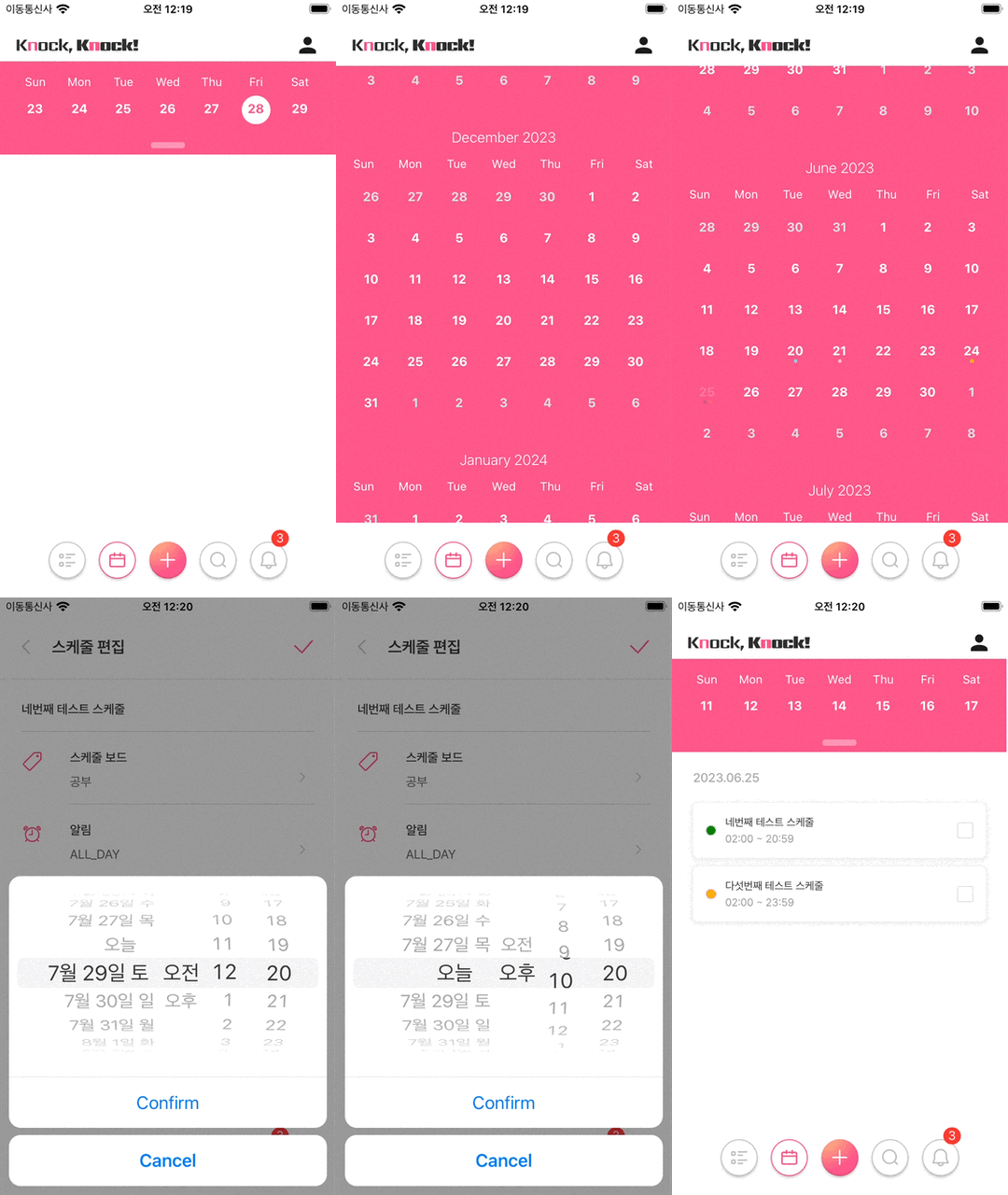
캘린더를 통한 일정관리 스크린 구현
위 기능을 목표로 선택한 라이브러리는 자유도가 높고 유지보수가 꾸준한 React-native-calendars다. Calendar 컴포넌트를 기본 베이스로 CalendarList와 Agenda 확장 컴포넌트를 함께 제공하는데 CalendarList의 경우 무한 스크롤로 이어지는 달력 기능이며 Agenda는 기존 Calendar 컴포넌트와 FlatList를 조합하여 캘린더 데이터를 리스트 형태로 출력해주는 확장 기능이며 FlatList의 경우 구체적인 스타일 수정이 어려웠다.
하지만 기획단계에서 의도한 캘린더의 기능은 Agenda와 거의 흡사했기 떄문에 Agenda 컴포넌트로 달력의 스타일을 수정하고 선택된 날짜의 데이터를 커스텀된 FlatList 컴포넌트에 전달하여 Calendar Data List를 랜더링하고 Multy Dots을 구현, 백앤드 Api와 Agenda의 연결, 최대한 가독성 있는 레이아웃을 구현하는 것을 목표로 라이브러리를 활용했다.
Agenda의 다양한 속성(attribute)
레이아웃 구현과 데이터 랜더링을 위해 사용된 속성을 정리했다.
export type AgendaEntry = {
    name: string;
    height: number;
    day: string;
};
export type AgendaSchedule = {
    [date: string]: AgendaEntry[];
};
const theme = {
  calendarBackground: variables.main, // 캘린더 배경
  monthTextColor: 'white',
  textDayFontWeight: 'bold' as any, // 날짜 서체
  dayTextColor: 'white', // 캘린더 날짜 색상
  textDayFontSize: 14, // 캘린더 날짜 글씨 크기
  textSectionTitleColor: 'white', // 요일 날짜 글씨 크기
  todayTextColor: 'yellow',
  agendaDayTextColor: variables.text_3, // 날짜 글씨 색상
  agendaDayNumColor: variables.text_4, // 요일 글씨 색상
  agendaTodayColor: variables.main, // 당일 글씨 색상
  agendaKnobColor: '#ffffff60', // Knob => 문고리 / 캘린더 접었다폈다 하는 아이콘 색상
  indicatorColor: 'red',
  selectedDayBackgroundColor: 'white',
  selectedDayTextColor: variables.main,
  'stylesheet.calendar.header': {
    week: {marginTop: 0, flexDirection: 'row', justifyContent: 'space-between'},
  },
};
const markedDates = (selected: Date, today: string) => {
  return {
    [dateFormat(String(selected))]: {
      selected: true,
      selectedColor: 'white',
      selectedTextColor: variables.main,
      customContainerStyle: {
        borderWidth: 1,
        borderColor: '#fff',
      },
    },
    [today]: {
      selectedColor: 'white',
      selectedTextColor: variables.main,
      color: 'yellow',
      customContainerStyle: {
        borderWidth: 1,
        borderColor: '#fff',
      },
    },
  };
};
flatList 관련 속성은 대부분 Agenda의 최적화를 위해 사용되는 값이다.